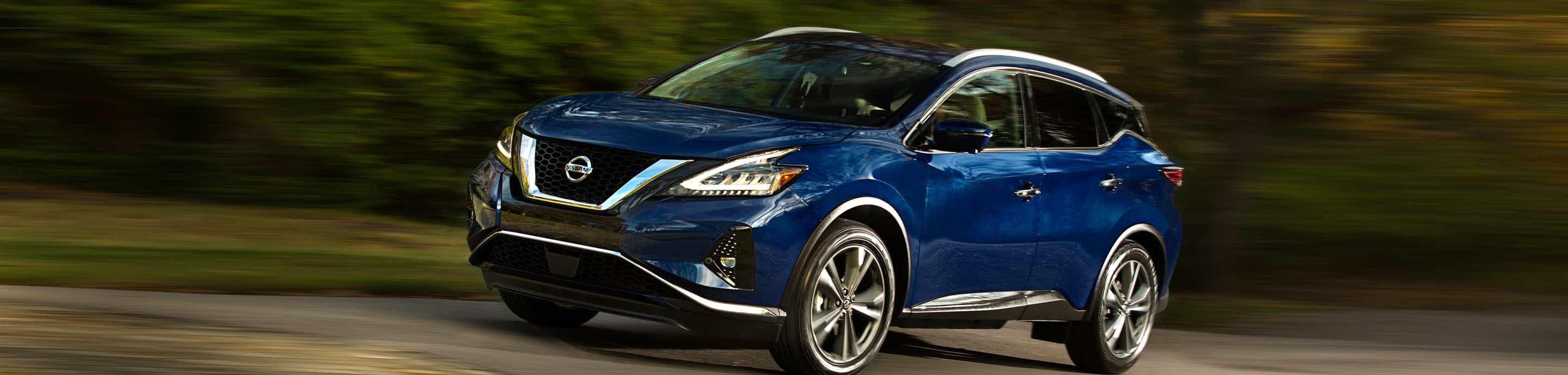
Is it just the angle, or are the earlier 3rd Gens (maybe 2015-2018) designed differently in the rear? Lots of bulging in most of the photos I've seen posted by others. The shots of the rear of my 2021 don't seem to look so step-like and flaring in places. I almost think Nissan later flattened out or pushed in the area around the rear marker lights or something, (and maybe made things less curvy) because things look very different to my eye. I also think they tapered in the tail lights so they don't look so sharply outward.
I was looking for custom exhaust tip exposures but wanted either dual ovals (very compressed laterally) or triple rounds that were very small. Your tips are very over-sized for the area, but are in keeping with the overall blown-out look of that model. They kind of remind me of the exaggerated look you get with some cartoon animations.
I had planned somewhat similar lettering and placement on my 2021 with a custom word, but never got around to doing it. Yours looks nice. In my Photoshop mock-up, I found leaving the lower lettering on both sides of the license plate seemed to bring balance to the rear. Just having the upper lettering seemed a bit top heavy. However, in looking at this again, I think I would put a custom word above the plate canopy, then place another word on the bottom face of the hatch that's more spaced out than the top lettering. If I did it that way, I'd probably remove the side-plate lettering.
Maybe...
P__L__A__T__I__N__U__M
M_____U_____ R_____ A_____N_____O
or
P__L__A__T__I__N__U__M
E_____D_____I_____T_____I_____O_____N
or
M__U__R__A__N__0
P_____L_____A_____ T_____I_____N_____U_____M
All lowercase could look nice too...
p__l__a__t__i__n__u__m
m_____u_____ r_____ a_____n_____o